Built, launched and run by me
EcoFlyp
Organic traffic across the platform grew 7x in six months, on search-led discovery rather than ad spend.
- 7x
- Organic traffic in six months
- 80th
- Percentile on engagement, conversion and retention
- ₹999
- Total spend, build and marketing
The beginning: a problem hidden in plain sight
Some ideas arrive in a flash. Others stay with you for years. EcoFlyp belonged to the latter.
For over a decade, one observation stayed with me: people genuinely want to do better for the planet, but they often don't know where to begin. The intent was never missing. The friction was discoverability.
Whether it was donating old clothes, finding a pickup service, locating a recycler, discovering a sustainability workshop, or exploring green roles, the ecosystem felt deeply fragmented. The solutions existed. The pathways did not.
This stayed with me through my journey across marketing, fast-moving startups, digital growth, and sustainability-led work. Over time, one core insight became the foundation of EcoFlyp:
People search for actions, but organizations market themselves.
No one searches for the name of a sustainability startup. They search for:
- where to donate old clothes
- clothes pickup near me
- e-waste recycling
- thrift shops in Bengaluru
- sustainability jobs
- volunteering opportunities
This mismatch between intent and discoverability became the core problem statement.
Strategic product decision: start narrow, validate fast
The long-term vision was large: to build the operating system for eco-friendlier decisions. But large visions need sharp, targeted market hooks.
I deliberately chose a high-frequency, emotionally relatable, and operationally searchable use case: old clothes and textile waste.
This served as a powerful market hook because:
- almost everyone faces this problem
- search intent is high
- local discovery matters
- action pathways are fragmented
- trust is important
The first build focused on city-based discovery pages for Bengaluru, Pune and Mumbai. These pages answered one practical question: what do I do with old clothes? Donate? Recycle? Thrift? Arrange pickup?
These early city pages are where the pattern first showed. Organic traffic across the platform has since grown 7x in six months. It's a masterclass in search-led awareness, proving that when you solve for consumer discovery, high-intent traffic follows naturally without ad spend.
Brand strategy: why EcoFlyp had to feel different
One of the most important strategic decisions was this. EcoFlyp could not look like:
- an NGO brochure
- a fear-driven climate platform
- a corporate ESG dashboard
- a guilt-driven sustainability platform
That would alienate mainstream users. The brand needed to feel optimistic, structured, credible, action-oriented, calm and hopeful. The core emotional positioning was:
Capable, not guilty.
That principle shaped every brand and design decision.
Identity: why the colours were chosen
The colour system was intentionally semantic. It was not just aesthetic. Each colour mapped to a human action.
Blue — structure, trust, ocean, work
#288fff · #0066dd
Blue anchors the product in trust, clarity, technology, credibility, and the ocean. The ocean metaphor has always been central to EcoFlyp's identity: eco-friendlier decisions are not isolated drops; they are part of a larger ocean of possibilities. Blue therefore represents both trust and the oceanic ecosystem of opportunities, and becomes the emotional and structural backbone of the brand.
Green — sustainability, progress, action
#5eedd0 · #33ddbb
Green is the most intuitive sustainability colour, but I deliberately avoided dark, overly serious greens. Instead, I chose a brighter mint-leaning green — because EcoFlyp is about progress, not purity. This green communicates freshness, movement, optimism and action. It feels modern and product-led.
Orange — warmth, humanity, nudges
#ffbb77
Orange was introduced as a humanizing accent. Sustainability products can often feel cold or preachy; orange introduces warmth, friendliness, encouragement and soft nudges. This was especially important for CTAs and helpful states. It makes the platform feel less intimidating.
Logo thinking: why the dolphin
The dolphin was one of the most intentional identity decisions. It was never just a mascot.
The dolphin embodies everything EcoFlyp wants to feel like: intelligent, social, agile, optimistic, friendly, and highly aware of its environment. These qualities mirror the brand personality and product experience. More importantly, dolphins are deeply tied to oceans, ecosystems, and environmental awareness — a natural symbol for a platform built around an ocean of eco-friendlier ways.
Why three dolphins in a circle
At the most strategic level, they represent the three core user actions EcoFlyp is built around: Work, Participate, Implement. This directly mirrors the platform architecture.
The circular movement symbolizes continuity, circular economy, flow, collective momentum and systems thinking. No eco-friendly action exists in isolation; each action feeds into another. The circle therefore represents the idea that better decisions create momentum, and momentum creates larger change. Visually, it also reinforces waves and motion, staying true to the ocean metaphor embedded in the brand.
Typography decisions
Typography was one of the strongest identity choices.
Livvic for headings
Used for titles, hero headings, page identity and brand moments. Livvic balances structure, friendliness, motion and confidence: its slight roundedness makes it feel approachable, its geometry makes it feel decisive. This mattered because the product needed to feel modern but not cold.
Anek for body text
A highly intentional India-first choice. Anek is extremely readable, multi-script friendly, highly scalable and mobile-first. Given EcoFlyp's long-term vision across Indian cities and accessibility contexts, this was a systems decision, not just a design preference.
Livvic gives direction. Anek gives depth. That duality became central to the identity.
Design philosophy
The visual language was built around what I call soft neo-structured design.
The platform needed to feel calm, modular, trustworthy and easy to navigate. That led to:
- strong containers
- defined borders
- clean content blocks
- subtle depth
- strict grid discipline
- zero visual chaos
I deliberately avoided cluttered landing page aesthetics, loud gradients, and decorative sustainability icons everywhere.
Clarity builds trust. Especially in this category.
Product architecture thinking
A major structural product decision was capability-first architecture.
Instead of organizing the ecosystem by organizations, I designed EcoFlyp around actions. The platform asks what do you want to do, not which company do you know. That led to three foundational user pathways:
- Work — green roles, volunteering, internships
- Participate — events, drives, workshops
- Implement — donate, recycle, thrift, repair, buy
This architecture later informed navigation, discovery pages, filters, page taxonomies and SEO strategy. It is what makes EcoFlyp fundamentally different from a directory. It is a decision-support system.
What has been built so far
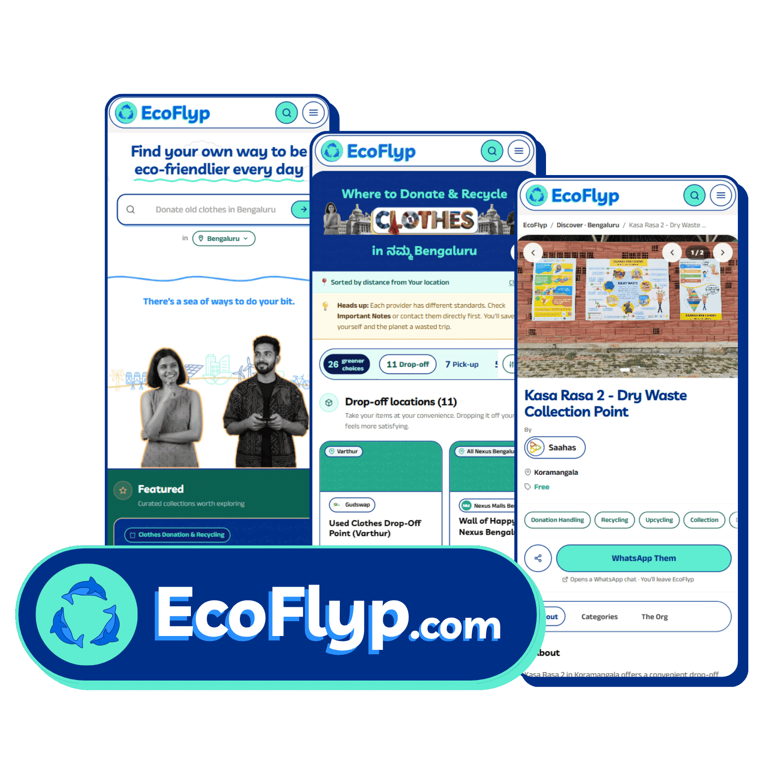
Today, EcoFlyp has evolved from concept into a functioning discovery platform with:
- city-specific discovery pages
- organic SEO traction
- action-first taxonomy
- product design system
- component architecture
- capability page structure
- navigation logic
- early GTM validation
The Bengaluru clothes page currently serves as the strongest early proof of demand.
What makes this different
EcoFlyp is not a listing website, a directory, an eco marketplace, or a blog.
It is a discovery layer for sustainability actions. It reduces friction between intent and action. That is the real product.
Current stage
Today, EcoFlyp sits at the intersection of brand strategy, product systems, sustainability discovery, organic search validation and founder-led experimentation.
This is still the beginning. The long-term ambition is to make eco-friendly decisions as discoverable as ordering food or booking a cab. One action at a time.
Ready to explore the live results?
Start with a free BrandDNA, or tell me what you are building.