Inner Catalystby Dr. Mohan Karambelkar
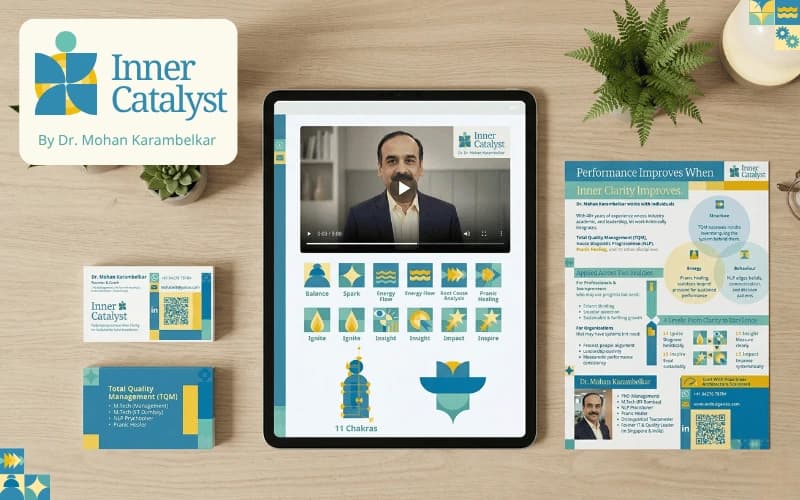
Three unrelated disciplines resolved into one identity, and a founder who now extends it himself across decks and digital assets.
Situation
Inner Catalyst was founded by Dr. Mohan Karambelkar, a seasoned professional with 40+ years of experience across industry, academia, leadership, coaching, and healing disciplines.
Before the visual development began, I renamed the brand from Performance Catalyst Network to Inner Catalyst. This strategic shift moved the identity from a descriptive service name to a human-centric, premium brand: one that could appeal equally to individuals seeking personal growth and corporate organisations focused on leadership development.
The brand needed to represent a unique methodology built at the intersection of Pranic Healing, Neuro-Linguistic Programming (NLP), and Total Quality Management (TQM). These three fields are conceptually rich but visually and tonally very different.
The challenge was strategic positioning and accessibility: the founder, at 64, needed a visual and communication system that felt modern and credible to professionals and organisations, while remaining simple enough to understand and use independently.
Task
The core challenge was to create a single, cohesive brand identity that could unify spirituality, behavioural science, and systems thinking.
The brand had to solve for three key tensions:
- Integration of three vastly different disciplines into one clear narrative
- Modern visual credibility for high-performing professionals and corporate audiences
- Extreme simplicity in visual execution for independent use by the founder
The system needed to avoid spiritual clichés, instead building trust through structure, calmness, and clarity.
Action
I approached the brand development as a systems design problem. First, I translated the methodology into a clear strategic framework: performance improves when inner clarity improves.
To visually unify the disciplines, I drew from soft Bauhaus principles, using simple geometric forms, circles, grids, and modular layouts. The visual language intentionally leaned into:
- Soft geometric forms & balanced grids
- Intersecting circles
- Muted teal, turquoise, and warm gold tones
- Clean serif to sans typography hierarchy
- Calm, whitespace-driven layouts
Every asset was designed with replicability in mind so the founder could independently extend the visual language.
Result
The result was a cohesive brand system that brought together three seemingly unrelated disciplines into one modern identity. The brand now communicates:
- Calm authority & Systems-led clarity
- Human-centered performance
- Modern professional trust
Most importantly, it became a usable brand system, not just a beautiful one. Dr. Mohan now independently extends the visual language across workshop decks and digital assets.
Want something like this?
Start with a free BrandDNA, or tell me what you are building.